
STRATEGY & NAMING
We have created a strong brand name that is derived from the German word for bike "Rad" and the word "radical". Radify provides radical urban design and a unique selection of bike brands. Together we radify our lives and seek to play an active part in the cycle revolution.
BRAND DESIGN
The brand design visualises the identity of Radify: a powerful, loud, urban bike movement while providing high-quality, functional design. Besides the logo, colors and typography, we developed illustrations and letterings to display the powerful messages of Radify.

TYPOGRAPHY

WE ARE RADIFY

LAYOUT GRID

BRAND GUIDE

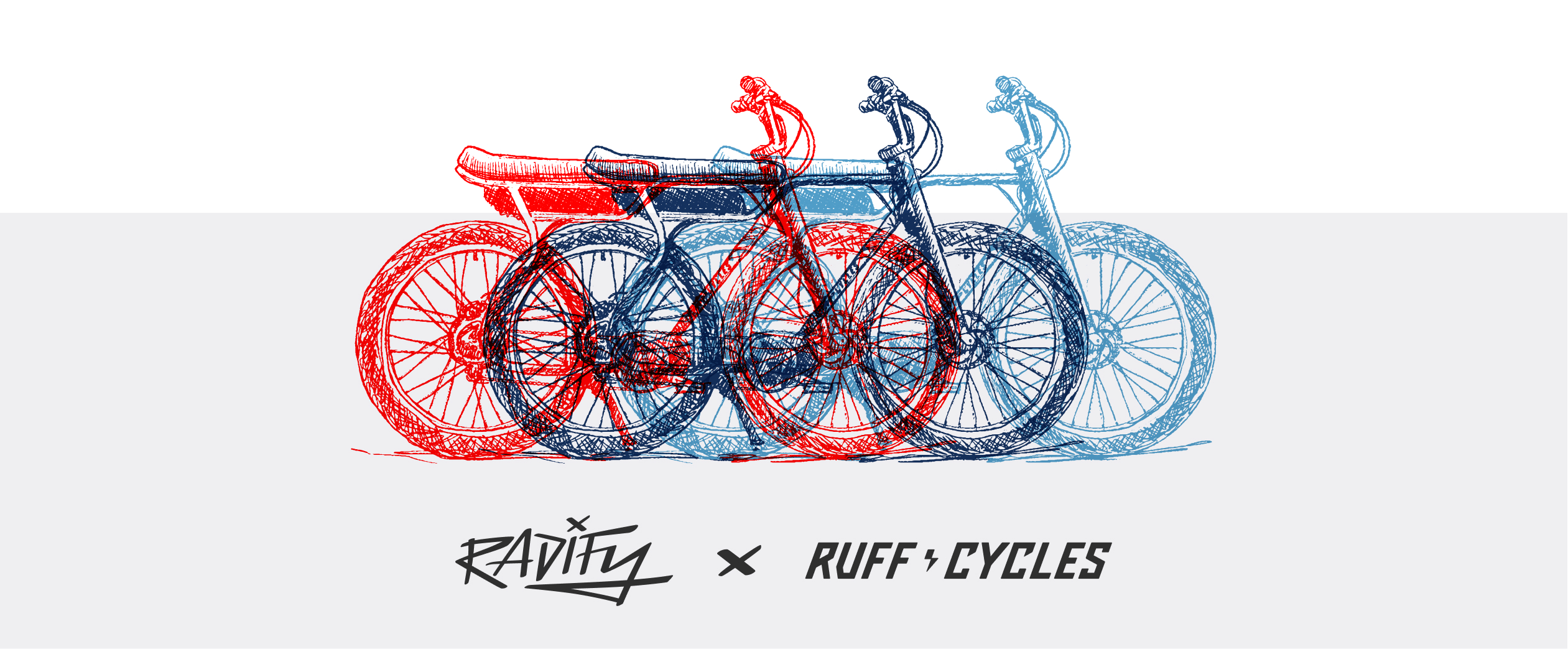
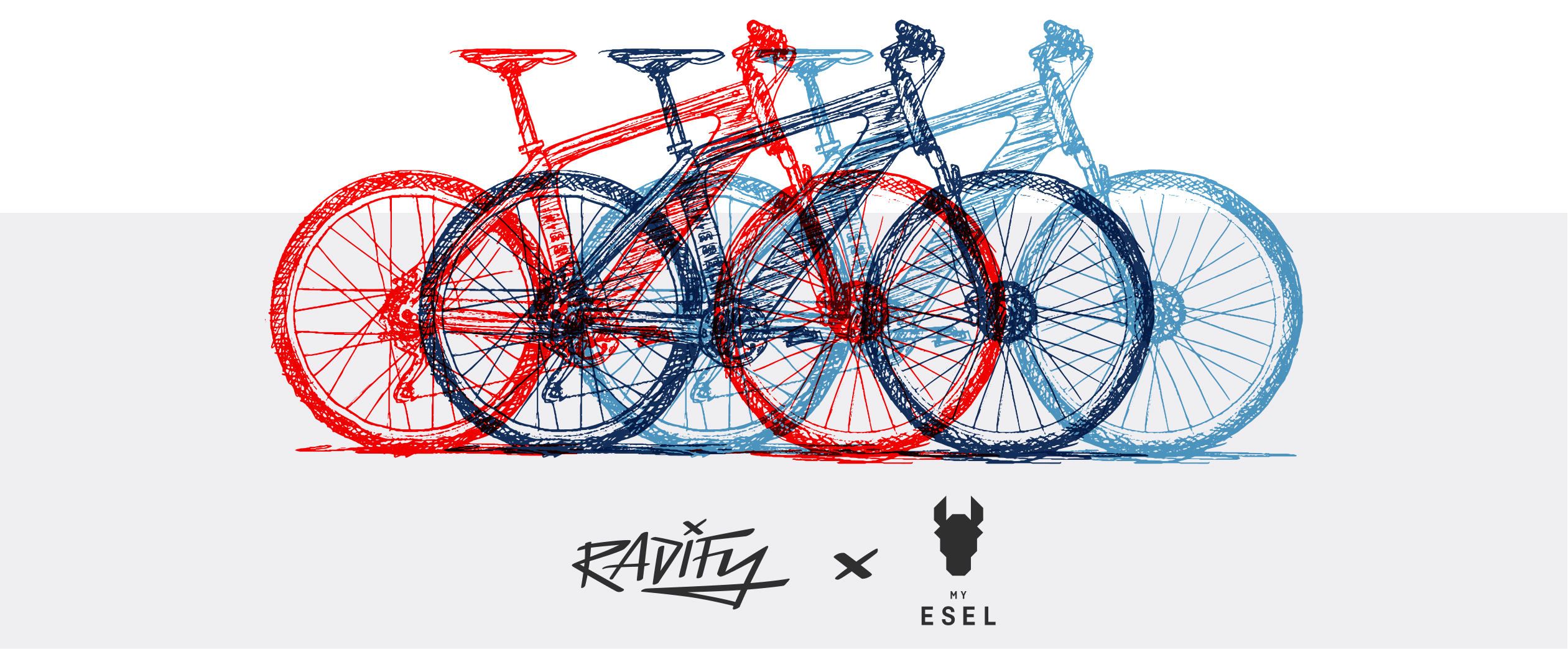
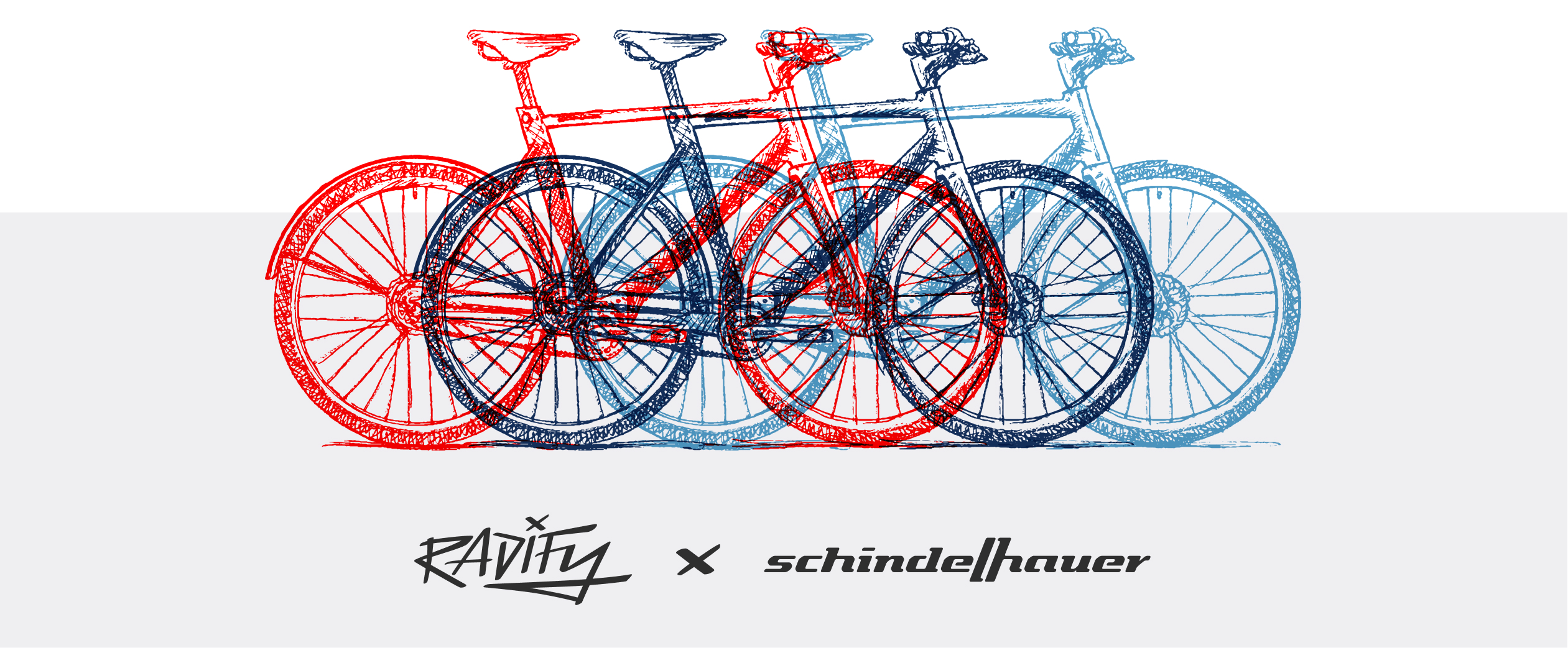
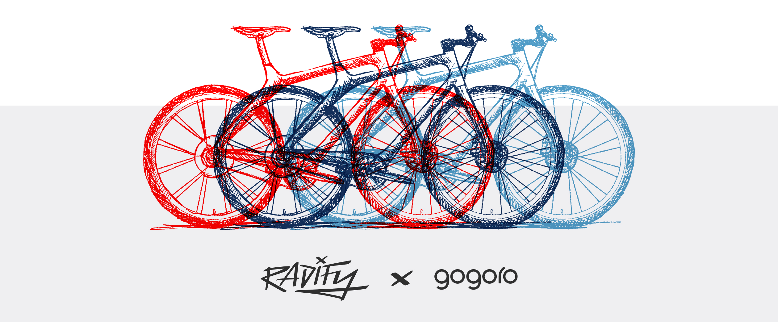
SELECTED BRANDS
Radify offers their costumers a fine selection of outstanding bike brands. They all are very different in their style, but share high quality workmanship and excellent design. Our bike illustrations give all these brands a unified look, but also show their beautiful features.
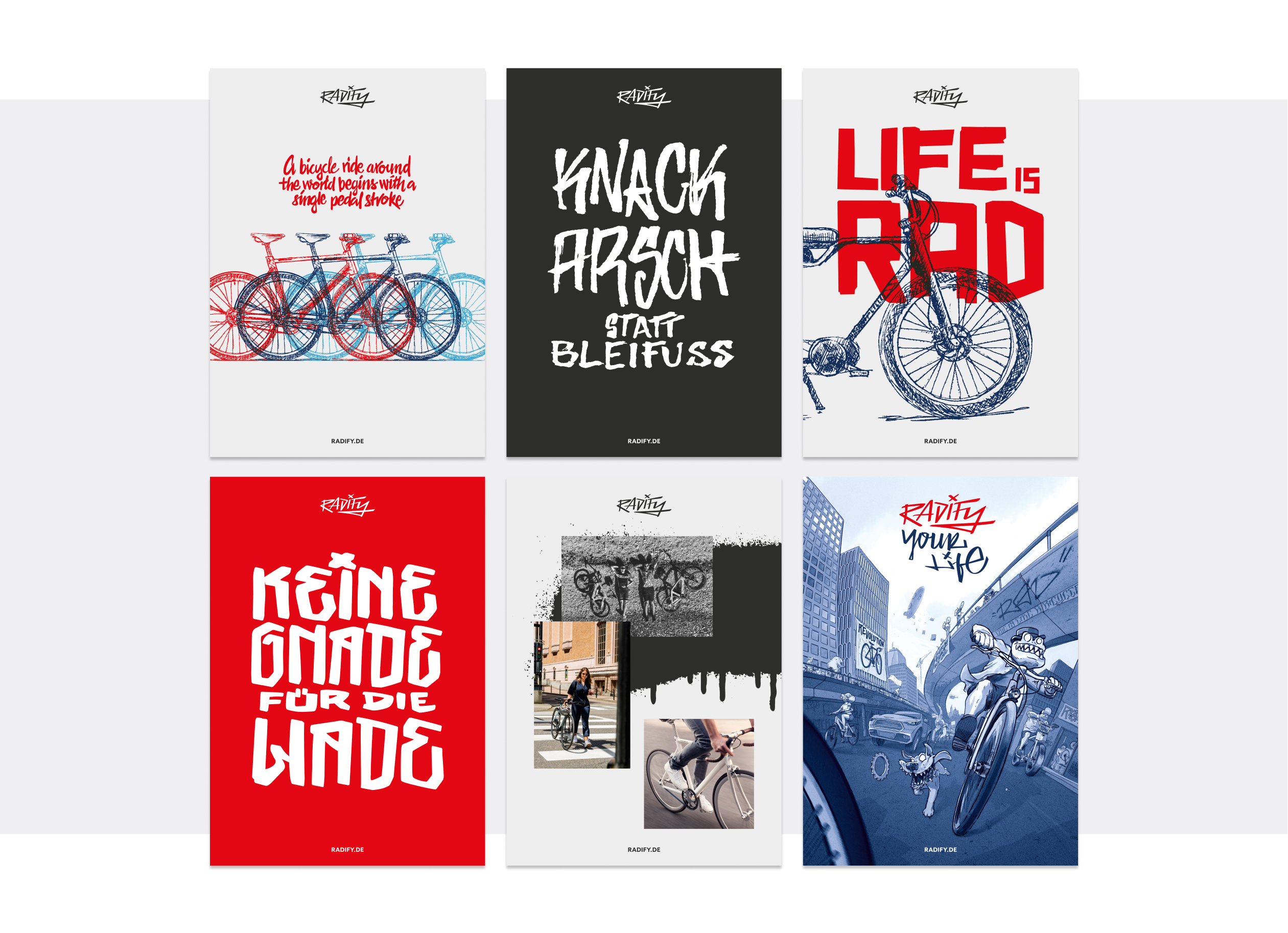
LETTERINGS
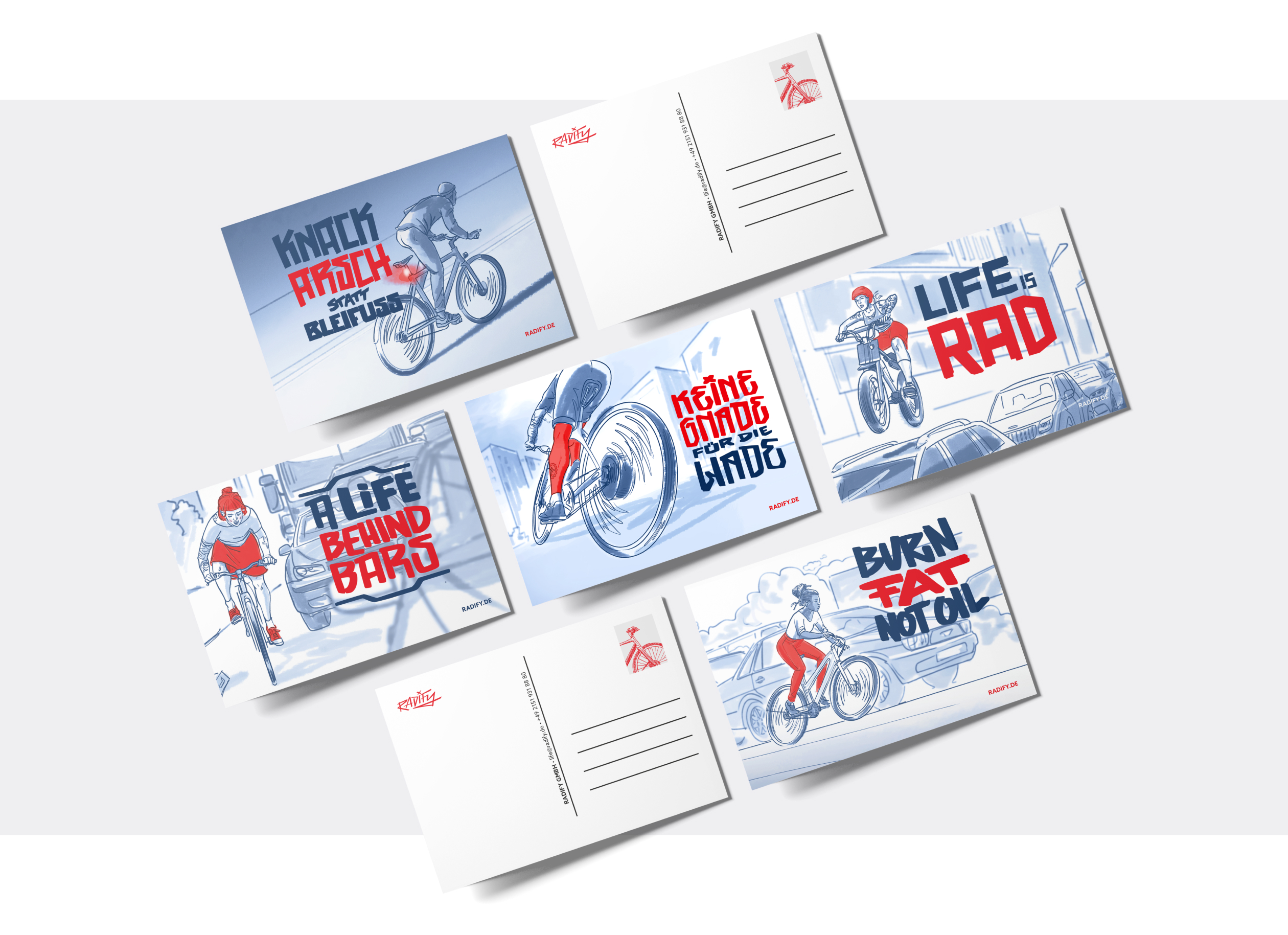
All the Radify letterings are hand drawn and communicate the bold Radify messages in the bike community over the whole world.

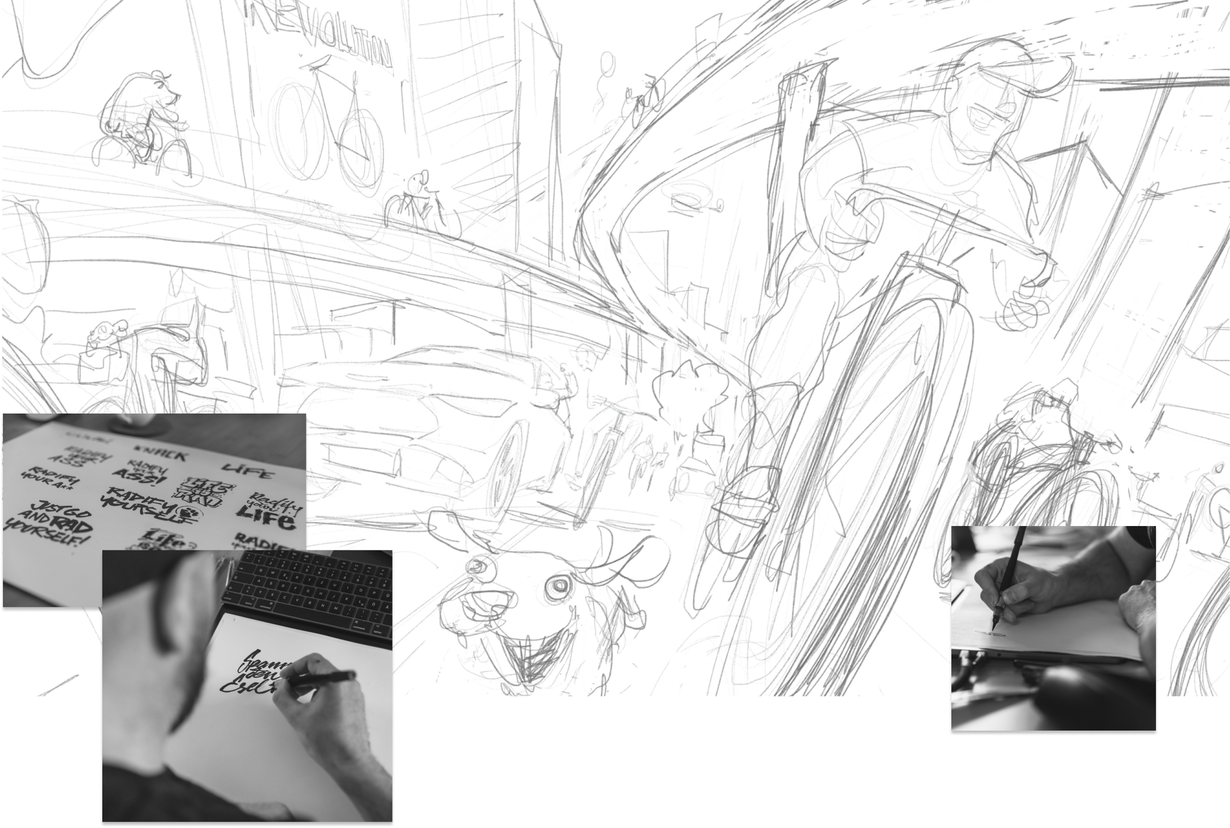
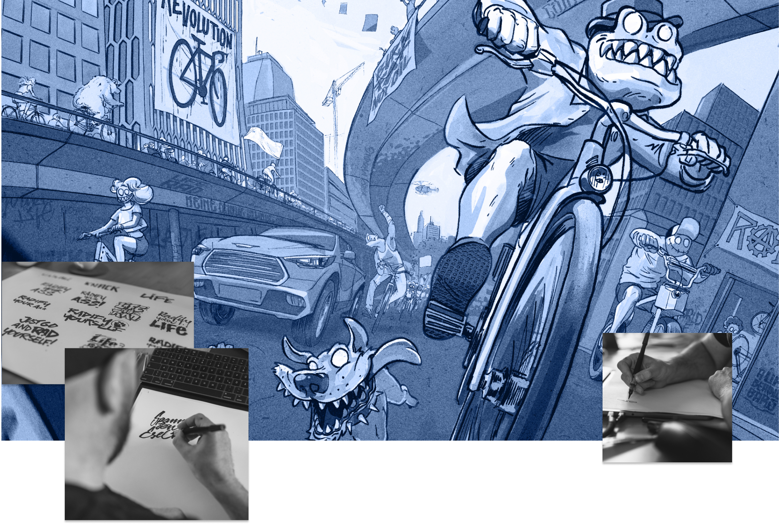
ILLUSTRATIONS
The hand drawn illustrations of urban bike scenes visualize the radical street art background of Radify. They generate a huge recognition factor and visibility for the brand.
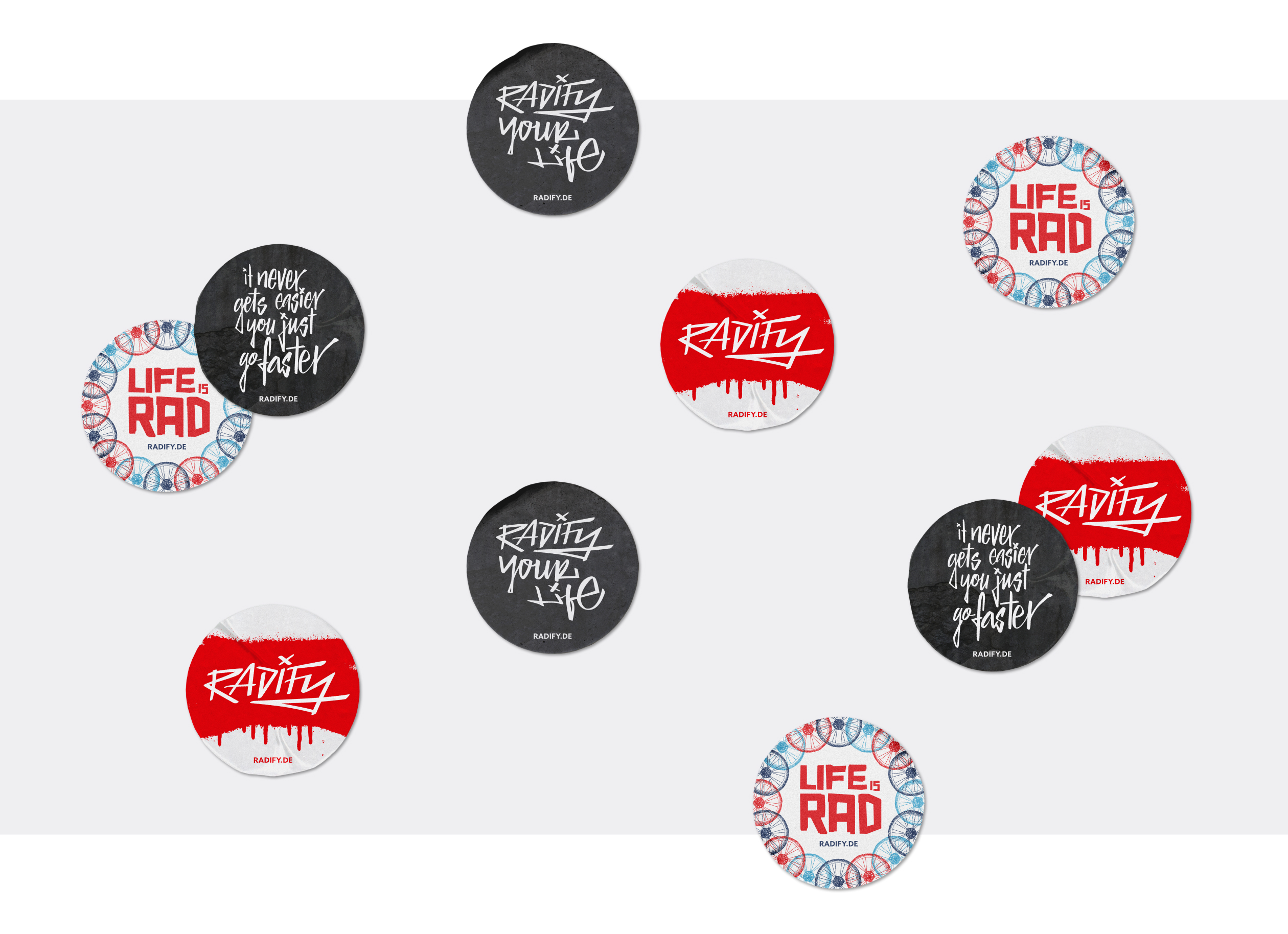
EXPERIENCE TOOL
Through an extensive toolkit, Radfiy becomes an experiential brand on all levels for its customers, its crew and the cycling community. Amongst others we created postcards, art prints and stickers.
CORPORATE ESSENTIALS

Pascher+Heinz GmbH · Joseph-Wild-Straße 13 · 81829 Munich · Germany
 E-Mail
 Phone
Phone Google Maps
 LinkedIn
 Instagram
Get insights and inspiration
© 2024 Pascher+Heinz GmbH
