Brand Design
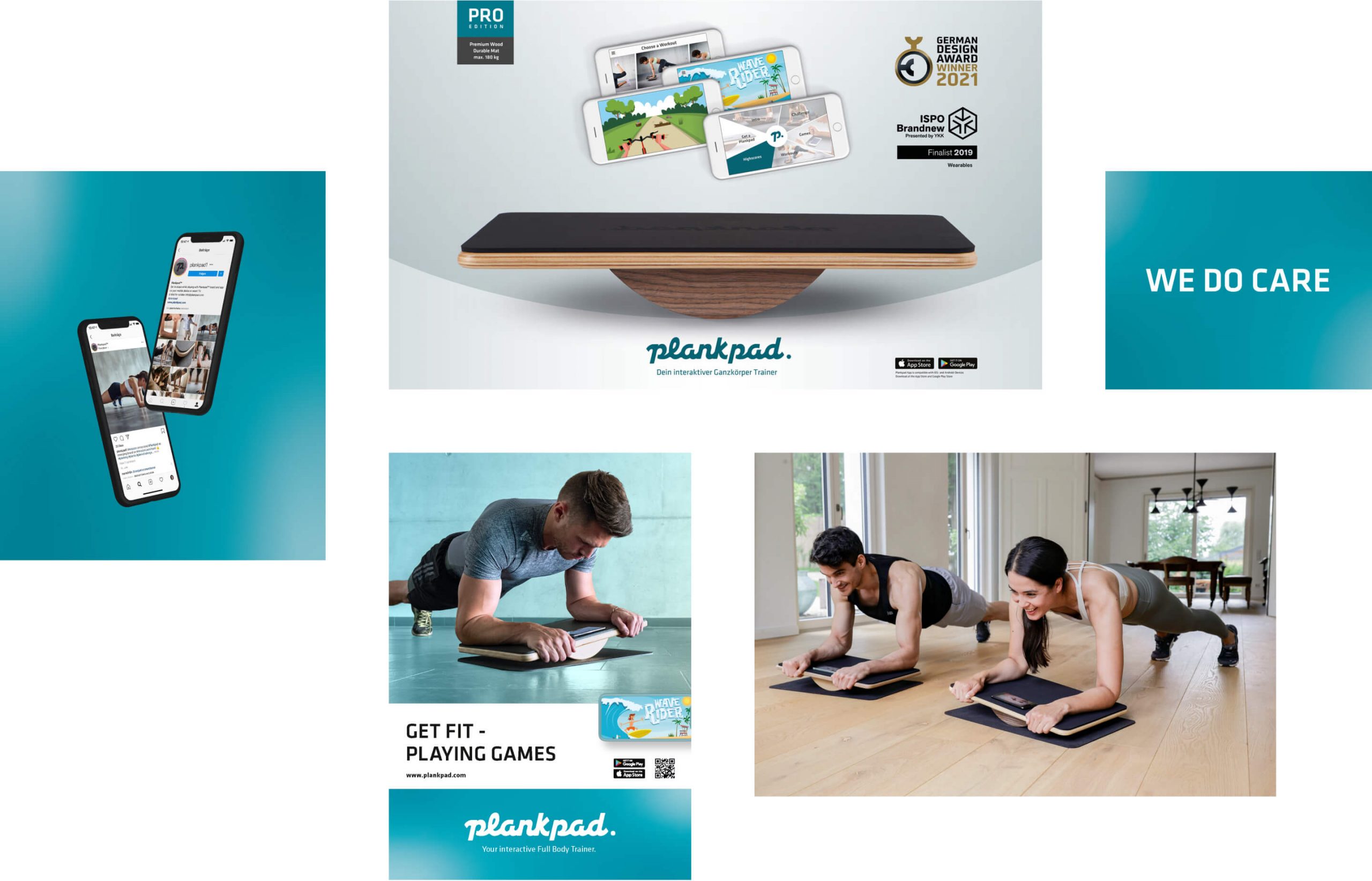
Plankpad combines playful effective full-body training with a modern, unified aesthetic. It aligns perfectly with the current trends in health and "new home" lifestyle. The brand elements reflect approachability, high quality and versatility, creating a strong and holistic identity.


Typography
The Klavika typography for plankpad is open, humanistic, and confidently bold. It blends digital precision with organic forms, offering versatility that aligns with the brand's visual language.

Color
Warm, motivating, and confident brand colors give plankpad a more open and dynamic character, with a broad color palette providing greater versatility and flexibility in design.


Brand Tonality
To create a warm and premium visual identity, the tonality focuses on high-quality materials and authentic, family-friendly environments. The look features versatile, contrast-rich yet minimal tones, depicting both supportive, challenging training and enjoyable experiences through various scenarios.

Brand Experience
As an elementary part of a brand relaunch, a holistic experience tells the story of plankpad across all touchpoints. In addition to a comprehensive website, an easily accessible app, and sustainable packaging, the brand design is also featured across social media assets and adverts. The tools are aligned with each other and create together a consistent performance.


Credits
Photographer: Michael Müller
Pascher+Heinz GmbH · Joseph-Wild-Straße 13 · 81829 Munich · Germany
Get insights and inspiration
© 2024 Pascher+Heinz GmbH
 Instagram