
As part of the ABUS brand relaunch, the first digital design ideas for the new website appearance have emerged. The area of mobile safety, which includes bicycle helmets and locks, is the first to benefit from the new design – large, emotive imagery and bold typography that highlights both products and brand, as well as a sophisticated user experience.

DIGITAL DESIGN
The design contains four main website templates as well as different modules, including a product and store finder, a product search and filter function, and a fully functional comparison tool to enable easy navigation of a complex product portfolio. A strong and extensive editable module toolkit, which allows website editors to tell rich stories and create landing pages on their own, combines both worlds – brand and product.


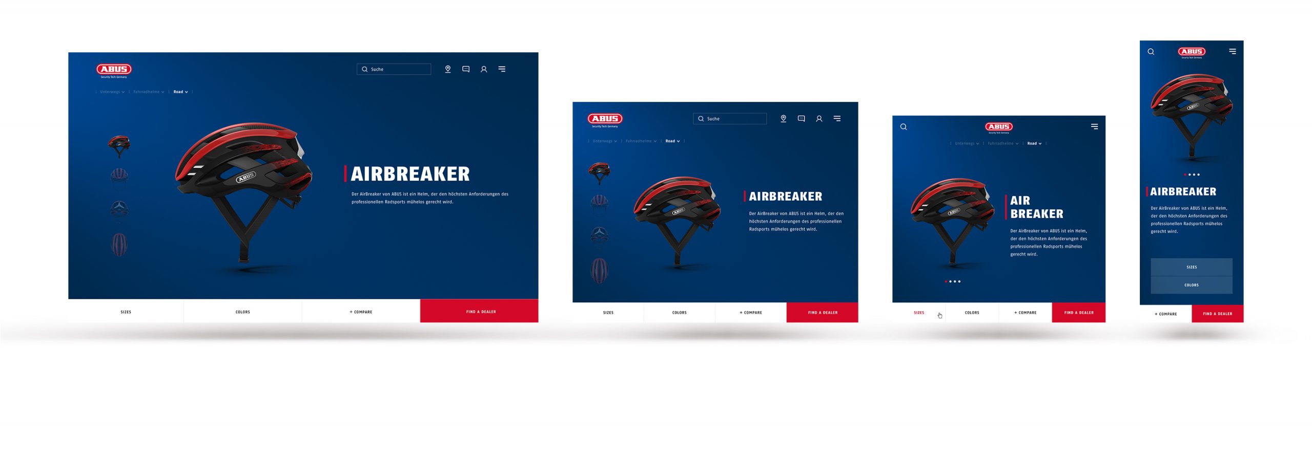
Main Templates
The four main templates – home page, category overview page, product overview page and product detail page – enable a fast and intuitive route from the first touchpoint on the website to the respective product. All pages are designed to ensure fluid responsiveness and to adapt perfectly to all mobile devices and large retina displays.

DESIGN SYSTEM
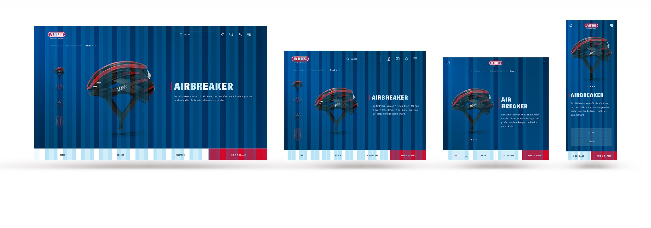
The Design System follows strict rules for every supported breakpoint. A percentage-based grid system with separate columns for UI elements and typography allows a highly flexible and responsive design with a state-of-the-art digital typography system.
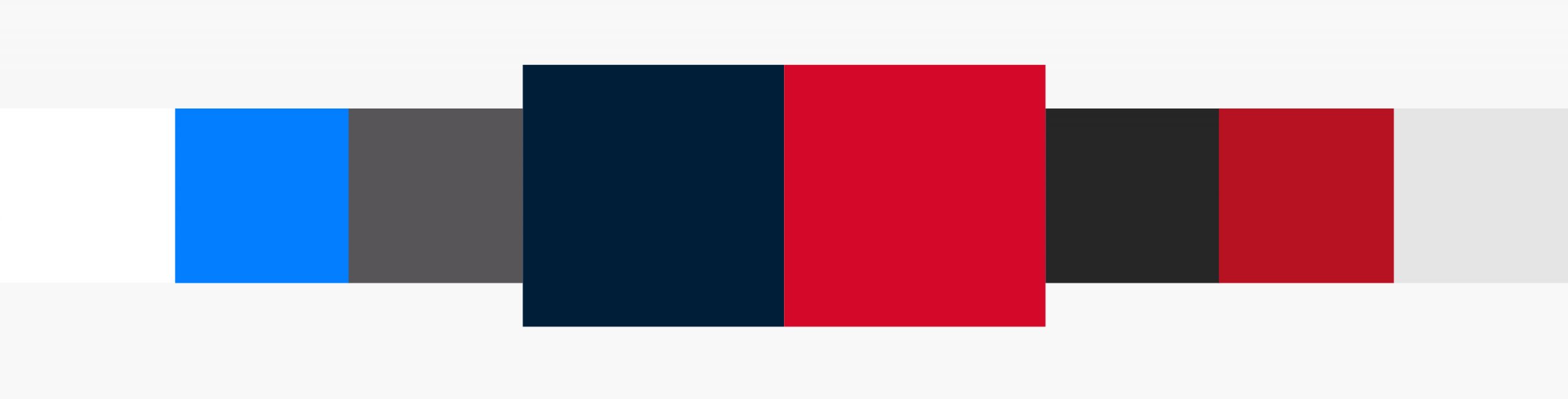
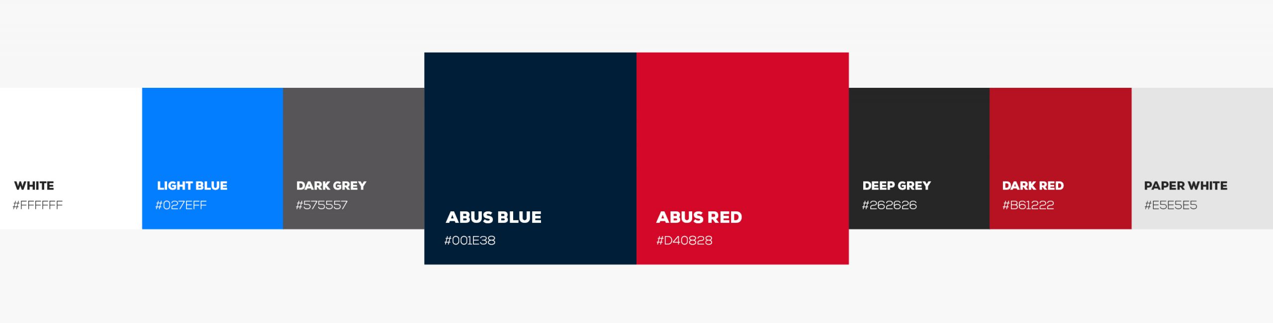
Colours
The ABUS main colours are translated from the brand design to ensure compatibility with digital interfaces. The use of paper white backgrounds allow a flat design.
Typography
Creation of a detailed typography system with an elegant corresponding headline and copy sizes, including the signature red ABUS anchor.

Product Card
The product cards lay flat on the darker background, show more product information and also accommodate the comparison function.

Image Crop
An intelligent cropping system was created for images used on the website. This system ensures that the important picture information is displayed with a fluid layout at all times.


Controls
All control elements exist for different backgrounds and contain all relevant states and micro-interactions.

Icons
Custom icon sets for controls, UI elements and technologies were created to maintain the overall brand language.
Mobile Design
The responsive design includes a consistent and holistic approach to whole-screen design for both mobile and desktop. This enables a unique experience to be created – even on smaller devices.

Credits
Photography: Michael Müller, Scott Markewitz
Renderings: KRB.BERLIN
Development: Interlutions, Inwebco
Pascher+Heinz GmbH · Joseph-Wild-Straße 13 · 81829 Munich · Germany
 E-Mail
 Phone
Phone Google Maps
 LinkedIn
 Instagram
Get insights and inspiration
© 2024 Pascher+Heinz GmbH
